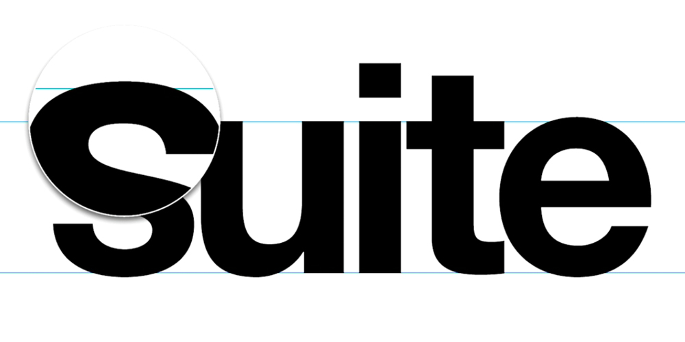
Type is designed so that the round letters are bigger than the straight ones. This is to overcome for the optical illusion that is created when rounded letters are next to straight ones. Because the anatomy of the round letters only touch at a much smaller point on the x-height, they appear to be smaller.
Overshooting The X-height
As Designers we compensate for this type of optical illusion all the time. We use the overshooting technique to correct for these types of illusions. By overshooting rounded type it gives the type perceptual balance. Fun, right!
There is no correct or exact answer to overshooting. The better you are as a designer the better you will be at overshooting.
The rounded letters need to extend slightly above the x-height line to make up for the illusion. This is much easier to see up close.
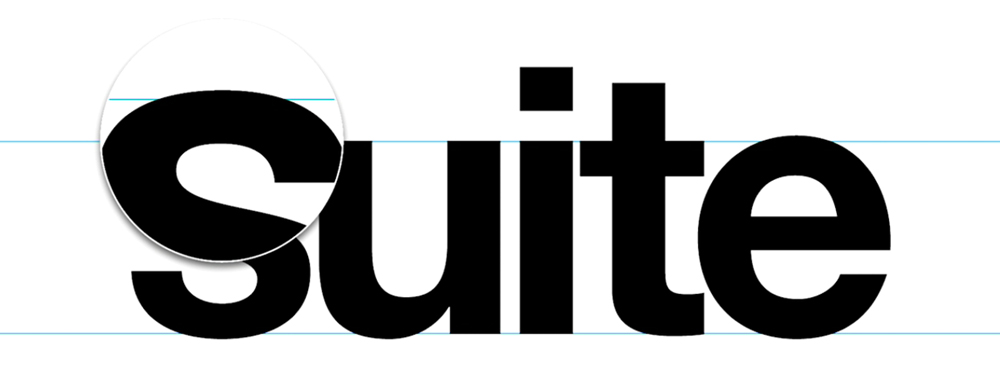
It’s a smaller detail but a universal one. The flat parts stay on the lines.
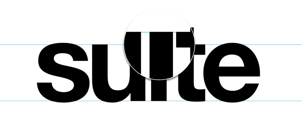
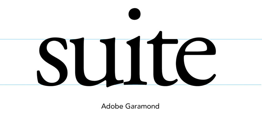
The same principle applies to serif fonts, lowercase letters and numerals as well.
Balancing Perceptual Mass
You want to use some of the usual design tricks to create this balance. Having a visual eye and being able to balance perceptual mass is important.
Here a some tricks you can use:
- Use the squint technique. Squint your eyes to refocus and help determine if the rounded letters are visually meeting the flat ones.
- Make the type as small as your thumb when you hold out your arm. By zooming out you will be able to focus on the off areas easier.
- Flip the type upside down. By looking at the type from this prospective, issues with type balance will standout more.
Choosing a Good Font
Type designers have to compensate for many optical illusions like spacing, overshooting, sharp intersections and more. Many fonts may have a great concept but are not executed properly. This is why it recommended to stick to tried and true fonts like Arial and Open Sans, especially if you haven't developed an eye to pick out these imperfection.
All so by working with classic fonts you get a sense for how a great font should look and feel, weightless and effortless. So use caution when picking out your next font and when in doubt go with a classic type face.
Conclusion
These are just some of the quick tricks you can use to eyeball your type. By practicing and training your visual eye it will start to become a natural process that develops over time.