There are many different ways to animate with CSS and browsers are continually grown there animation abilities. I'm going to explore some common effects for CSS animations.
transform
Using the transform CSS property is currently the best-performing way to animate because it only requires compositing changes. Animation compositing is important because this is where the painted parts of the page are put together by the browser.
For this example I will show how you can animate on a circle. You can see a real working example of this on my homepage top section.

First we need to to create the a div for each animation that will layer over the background circle illustration. Because we are animating in circle we will only need to use the transform: rotate(); option.
We rotate the animation div with the illustration positioned in the upper left corner of that div or which ever corner is closest.
Example
<div class="wrapper-1">
<svg width="341" height="342" viewBox="0 0 341 342" fill="none" xmlns="http://www.w3.org/2000/svg">
<ellipse cx="170.5" cy="171" rx="170.5" ry="171" fill="#D9D9D9"/>
</svg>
<div class="motion-shape-1a">
<svg class="svg-shape-1a" width="100" height="100" viewBox="0 0 100 100" xmlns="http://www.w3.org/2000/svg">
  <circle cx="50" cy="50" r="50" />
</svg>
</div>
</div>
<style type="text/css">
.wrapper-1 {
position: relative;
display: inline-block;
margin: auto 0;
}
svg.svg-shape-1a{
position:absolute;
top: 0;
left: 0;
}
div.motion-shape-1a {
animation: circle 9s infinite linear;
width:100%;
height:100%;
position:absolute;
top:0px;
left:0px;
}
@keyframes circle {
0% {
transform: rotate(5deg);
}
25% {
transform:rotate(-2deg);
}
50% {
transform: rotate(5deg);
}
75% {
transform:rotate(12deg);
}
100% {
transform:rotate(5deg);
}
}
</style>You can see we give the layered div a width and height of 100% to match the wrapping div.
offset-path
Using the offset-path CSS property we can animate along an SVG path. For this example we are going to create a SVG circle and animate along it.
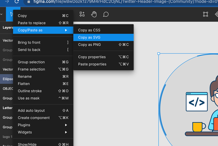
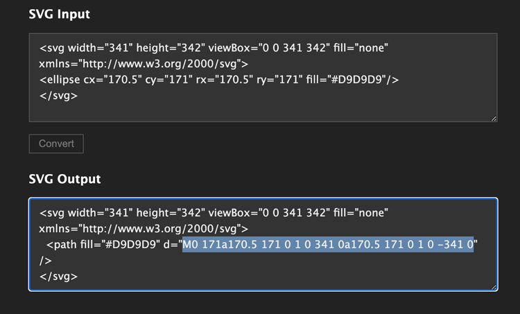
First we need to create the circle for the path. I used Figma and created a circle the same size as the circle in the svg. Then copy the circle as SVG.
<svg width="341" height="342" viewBox="0 0 341 342" fill="none" xmlns="http://www.w3.org/2000/svg">
<ellipse cx="170.5" cy="171" rx="170.5" ry="171" fill="#D9D9D9"/>
</svg>
We only need a circle here and our shape didn't need to use path; we will have to convert it to a path. There is a good online resource at online converter tools you can use to convert your SVG's to paths. This is going to use the offset: path() property.
svg.motion-shape-1 {
animation: move 12s infinite linear;
	offset-path: path("M0,170a170,170 0 1,0 340,0a170,170 0 1,0 -340,0z");
	transform: rotate(-140deg);
}
Now we will position the background and animating SVG's.
Example
<div class="wrapper">
<svg width="341" height="342" viewBox="0 0 341 342" fill="none" xmlns="http://www.w3.org/2000/svg">
<ellipse cx="170.5" cy="171" rx="170.5" ry="171" fill="#D9D9D9"/>
</svg>
<svg class="motion-shape-1" width="100" height="100" viewBox="0 0 100 100" xmlns="http://www.w3.org/2000/svg">
  <circle cx="50" cy="50" r="50" />
</svg>
</div>
.wrapper {
position: relative;
height: 380px;
text-align: center;
}
svg.circle {
position: absolute;
}
svg.motion-shape-1 {
animation: move 12s infinite linear;
offset-path: path("M0 171a170.5 171 0 1 0 341 0a170.5 171 0 1 0 -341 0z");
}
@keyframes move {
0% {
offset-distance: 0;
}
25% {
offset-distance: -12%;
}
50% {
offset-distance: 0;
}
75% {
offset-distance: 12%;
}
100% {
offset-distance: 0;
}
}The element will follow it's positioning within the parent container or SVG coordinate system. Notice how we start at the middle position and loop back to it with an infinite Linear motion.
transform: translate()
Getting just the right amount of animation can be done with small tweaks to CSS transitions and animations. Here are some examples of how to do this.
Example
<div class="shapes-container">
	<div class="shapes-col">
		<div class="shape-1"></div>
		<div class="shape-2"></div>
	</div>
</div>
.shapes-col {
display: grid;
grid-template-columns: 50px;
grid-template-rows: 360px;
justify-content: center;
}
.shape-1 {
width: 300px;
height: 300px;
background-color: blue;
z-index: 1;
animation-duration: 1s;
animation-name: fadeInOne;
animation-timing-function: ease;
}
.shape-2 {
position: relative;
top: 60px;
grid-column: 2;
width: 300px;
height: 300px;
background-color: green;
z-index: 2;
animation-duration: 1.2s;
animation-name: fadeInTwo;
animation-timing-function: ease;
}
@media (max-width: 45em) {
.shapes-col {
justify-content: center;
}
}
@keyframes fadeInOne {
0% {
opacity: 0;
transform: translateY(25%);
}
70% {
transform: translateY(-4px);
}
100% {
opacity: 1;
transform: translateY(0px);
}
}
@keyframes fadeInTwo {
0% {
opacity: 0;
transform: translateY(15%);
}
70% {
transform: translateY(-2px);
}
100% {
opacity: 1;
transform: translateY(0px);
}
}Cascading Animations with the Intersection Observer
It is recommend when running animations to use the Intersection Observer to fire the CSS animations in stead of an onscroll event. This is for obvious performance reasons and can be used to manage all of the animation events with the Intersection observer.
Beyond that you can automate the timing of multiple offset animations with the JavaScript setTimeout function. This will replace having to use CSS @keyframes for each animation like the example above.
Now we can write one transform CSS property to run all the cascading animations.
.vertical-section {
  display: flex;
}
.vertical {
  position: relative;
  transform: translateY(150px);
  opacity: 0;
  transition: .5s all ease;
}
.vertical.active {
  transform: translateY(0);
  opacity: 1;
}
We will use the wrapping vertical-section parent div class to target the inner child divs and loop over them.
<div class="vertical-section">
<div class="vertical">
    <h2>One</h2>
    <p>Lorem ipsum dolor sit amet, consectetur adipiscing elit. Etiam posuere quam sit amet pellentesque iaculis. Pellentesque habitant morbi tristique senectus et netus et malesuada fames ac turpis egestas.</p>
</div>
<div class="vertical">
    <h2>Two</h2>
    <p>Lorem ipsum dolor sit amet, consectetur adipiscing elit. Etiam posuere quam sit amet pellentesque iaculis. Pellentesque habitant morbi tristique senectus et netus et malesuada fames ac turpis egestas.</p>
</div>
<div class="vertical">
    <h2>Three</h2>
    <p>Lorem ipsum dolor sit amet, consectetur adipiscing elit. Etiam posuere quam sit amet pellentesque iaculis. Pellentesque habitant morbi tristique senectus et netus et malesuada fames ac turpis egestas.</p>
</div>
</div>
Now we can use the Intersection Observer to fire the animation on scroll, loop through each of the child divs and run a setTimeOut to create the delay or transition effect.
// all vertical and cascading animations add class
const target = document.querySelectorAll(".vertical");
const options = {
    rootMargin: "0px 0px -8% 0px",
}
function ioVertAdd(entries) {
  var delay = 0;
  entries.forEach((entry) => {
  	entry.target.classList.remove('active');
    if (entry.isIntersecting || entry.boundingClientRect.top < 0) {
      setTimeout(function () {
          entry.target.classList.add('active');
      }, delay)
      delay += 200;
  }
});
}
const observer = new IntersectionObserver(ioVertAdd, options);
target.forEach(targets => observer.observe(targets));
I have also noticed using this technique seems to create a smoother and more responsive animation than if we run multiple transform properties for each animation.
Example
One
Lorem ipsum dolor sit amet, consectetur adipiscing elit. Etiam posuere quam sit amet pellentesque iaculis. Pellentesque habitant morbi tristique senectus et netus et malesuada fames ac turpis egestas.
Two
Lorem ipsum dolor sit amet, consectetur adipiscing elit. Etiam posuere quam sit amet pellentesque iaculis. Pellentesque habitant morbi tristique senectus et netus et malesuada fames ac turpis egestas.
Three
Lorem ipsum dolor sit amet, consectetur adipiscing elit. Etiam posuere quam sit amet pellentesque iaculis. Pellentesque habitant morbi tristique senectus et netus et malesuada fames ac turpis egestas.
Conclusion
The point of this post is to show an array of animation options that can be used depending on the circumstance. Knowing these options will help you determine which animation approach to use for you situation.