Using type in creative ways opens up new ideas to introduce content to the user. By putting the type at a 3d angle we can use the extra space to scale up the font-size, create layout contrast and open up space on the page.
Using the perspective property has been commonly used to create flip cards, but what about type? After searching for how this could be done, I realized the best way would be to start from scratch. I thought that I was going to need some javaScript for this, but it turns out the easiest way to do it was with straight CSS.
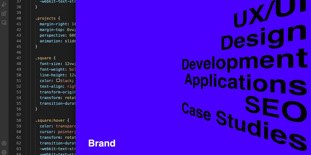
The perspective property will give us the amout of depth we want in pixels and then we can add the transform property to rotate the element.
Demo
In this example we are going to apply a 3d angled look to the font. Hover over the type to see it in action.
See the Pen Type Using Perspective CSS by Jeremy Faucher (@jeremyfaucher) on CodePen.
First nest two div’s, the outer div will set the perspective for the inner div. We can wrap the text in a p tag in the inner div.
By default the nested div pivots from the center axis. So we can add transform-origin: right; to pivot from the right end of the type.
Finally add text-align: right; and transform: rotateY(-40deg); to pull text right and put the 3D angle on it.
Now we can do a cool hover effect to pivot toward the user by reducing the rotation degrees on hover. I also increased the scale just a little to add to the effect that the type is getting closer.
Conclusion
Design is continually going through transformation stages as advancements in development progress. We saw it with textures and skew metimorphis to flat design and then with jQuery and scroling animations back to simple static layouts.
We tend to over do with what technology gives us and then adjust back to find the sweet spot. Regardless it allways comes down to how the user experiences the interaction.