Having motion on a page is a powerful tool for introducing a better or more enhanced user experience. It also comes with the responsibility of not over using it, or abuse it. Many enhanced user experiences, like skew metamorpohosis for example, go through a phase where it tends to be popular and gets over used. So it's important to keep in mind how people will react to your design choices a year or more later.
I am sure you can attest to the experience of being on a web page that has to much motion, to the point where you have to close the page to not be distracted. So you can imagine what this might be like if you had a disability that is sensitive to motion.
Vestibular Spectrum Disorder
Motion from animations or the parallax scrolling effect can trigger Vestibular Spectrum Disorder. Some users experience distraction or nausea from animated content. Especially with scrolling animations because of introducing another level of motion on top of an ready scrolling web page.
Operating systems have taken note of this by adding accessibility settings to reduce motion.
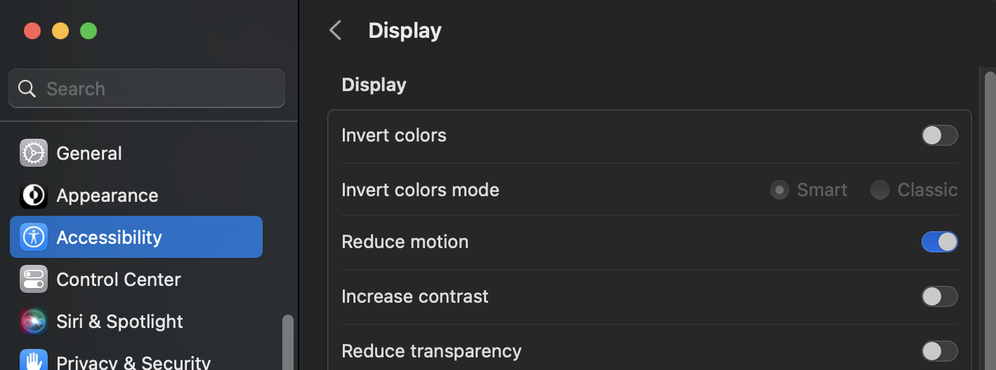
- For Mac this is in the Accessibility > Reduce motion settings.
- For PC this is in the Accessibility > Visual effects.
This setting works with the CSS prefers-reduced-motion feature of the @media property. There are a couple of ways to go about this depending on your situation.
prefers reduce motion @media property
The basic way is to simply wrap the prefers reduce motion @media property around a new class of the same name that your using for running the animation. Then add your reduced motion style to use on that accessibility setting.
.pulse {
  height: 15px;
  animation: pulse 2s infinite ease-in-out;
}
@keyframes pulse {
0% {
    background-color: rgba(165, 165, 165, 0.1);
  }
  50% {
    background-color: rgba(165, 165, 165, 0.4);
  }
  100% {
    background-color: rgba(165, 165, 165, 0.1);
  }
}

@media (prefers-reduced-motion) {
  .pulse {
    animation: none;
  }
}<div class="pulse"></div>This can be a reduced amount of motion or turned off completely with animate: none;.
To test this feature turn your computers reduce motion setting off and on to run the above code.
Example
Your reduce motion setting is on.off.
prefers-reduced-motion: no-preference
We can also wrap the original animation class in a prefers-reduce-motion: no-preference; property that will tell the the computer to only run animation if there is no preference set.
.pulse2 {
  background: var(--clr-example-one);
  height: 15px;
}
@keyframes pulsee {
0% {
    background-color: rgba(165, 165, 165, 0.1);
  }
  50% {
    background-color: rgba(165, 165, 165, 0.4);
  }
  100% {
    background-color: rgba(165, 165, 165, 0.1);
  }
}
@media (prefers-reduced-motion: no-preference) {
  .pulse2 {
    animation: pulsee 2s infinite ease-in-out;
  }
}<div class="pulse2"></div>Turn your computers reduce motion setting off and on to run the above code.
Example
Your reduce motion setting is on.off.
Conversly you can use the prefers-reduced-motion: reduce property that will do the same as prefers-reduced-motion: by it self.
Conclusion
Design and user experience go hand in hand. If the experience is not good, than that means there must be something wrong with the design. We typically see this when there is an over compensation for lack of design. So follow the design golden rule of, only using just enough when needed.