Picking colors for design is something that I struggle with. There are so many options and it can be hard to stick to a small set of colors. Not to mention the different palettes options like monochromatic, complementary and Analogous.
Simplify - by using three rules
Using too many colors can be distracting, overbearing and leave the user not knowing where to look or where they are supposed to go.
This is why I use these three base color rules when starting a new project.
- Choose a dominant color.
- Add two more colors.
- Apply the 60-30-10 rule.
There are a couple of ways to set up your three base colors while using the 60-30-10 rule.
Neutral, Primary and Secondary / Call to Action.
This way uses the background as the Neutral color.
Neutral Color 60%
Primary Color 30%
Sec. Color 10%
Dominant, Complementary and Accent.
This way does not use the background as one of the main colors and focuses on the content colors.
Dominant Color 60%
Complementary Color 30%
Accent Color 10%
They both can be applied to the 60-30-10 rule. Don't forget that whites, grays and blacks are colors too, and are often used in the base color palette.
1.Choose a Primary Color
The primary color should be 30% of the interface. It shouldn't overwhelm the interface and should denote importance and value.
Obviously, if you are working with a client that has a primary brand color to work from, you would start there. If you are starting from scratch then it will help to have a deeper understanding of the meaning of each color.
#4c9cdb
For this site I went with a more cyan blue that is a restful, calming color and symbolizes relaxation.
I wanted to use a primary blue that compliments a brighter cyan color. In this color pallet hierarchy, the primary color is important, but not as important as the cyan, that will be the call to action color for the theme.
2.Add two more colors
#75E9e9
Next is the secondary or accent color that should be used for call to actions and links. This is the color that will guide the user and get them where they need to go.
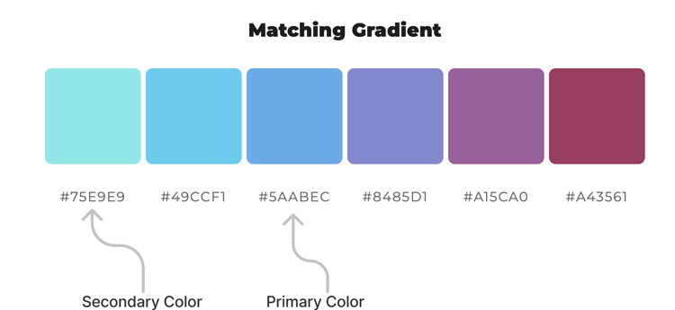
Using the mycolor.space tool I was able find a secondary matching gradient of my primary blue color. I use this tool as a guide and will tweak the color from here to get the just the right amount of contrast on the page.

Knowing that I wanted a bright cyan for my secondary color, I actually started looking for my primary color based on what matched with the #75E9e9 cyan.
#f0f0f0
Now we just need one more color to finish the base design colors. I used a gray that is just dark enough to contrast with the white sections.
This could be a light grey or a creamy color. If you are doing a dark theme it could be some sort of dark color. I stuck with a light grey for this theme.
3.The 60-30-10 rule
This rule was basically borrowed from interior design and is a classic decor rule. It's like the golden rule of color design, and you will see it throughout many social media sites and apps.
Neutral Color 60%
Primary Color 30%
Sec. Color 10%
We want to make sure that we are using 60% of the neutral. Then we use 30% for the primary color that is important and can be a brand color. The 10% is the secondary color and is the most important because it is the thing the says 'click-me' and should be used sparingly.
Applying your colors to the 60-30-10 rule is a quick, easy way to get your design's colors looking mature and well-thought-out. It's also going to help you understand how to use and implement color.
When to break the rules
Starting your projects using these classic design rules will give you the option to also break the rules along the way. For example, web design tends to have elements that call for more color options, like hover and active states.
Once you have your three color base design using the 60-30-10 rule, you can easily experiment and create your own color design rule, like this 50-20-20-10 formula.
Neutral Color 50%
Primary Color 20%
Secondary Color 20%
Accent Color 10%
Conclusion
This is basically the process that I work through - which helps to simplify a color design strategy. It gives you a quick, easy way to get your design's colors looking seamless and balanced.