So far we installed the Starter Bare theme and configured WordPress for a clean slate. Now we can create the Starter Beginner theme that will start to build out the pages of the website.
You can Follow along by downloading and installing the finished Starter Beginner theme from my GitHub.
We will be starting the homepage, header, body and footer and using custom responsive HTML and CSS. I will save showing all the CSS for last and go through the HTML first.
Enqueue Styles
First we need to enqueue our style.css to the head of the pages with the wp_enqueue_scripts function in functions.php.
functions.php
wp_enqueue_style( 'parent-style', get_template_directory_uri() . '/style.css', 1);The wp_enqueue_script function will enqueue scripts and styles that are meant to appear on the front-end. Despite the name, it is used for enqueuing both scripts and styles.
Header
We will create a standard layout header with the logo on the left and the menu on the right.
Admin - Menus
In the admin Appearance -> Menus create and Save Menu then in Menu Settings choose Main Menu and Save.
header.php
Now in header.php we use the wp_nav_menu function with the array of nav menu arguments. First we give it a theme_location that corresponds to the register_nav_menus function in functions.php.
We also want to remove the container div that WordPress adds. Then we will give the nav unordered list a class of header--menu.
The class syntax is a version of BEM (Block, Element, Modifier methodology) that I have been playing around with.
<header class="container--full">
<div class="header--content">
<div class="logo">
<h1><a href="/" rel="home">Starter</a></h1>
</div>
<nav class="primary-nav">
<?php wp_nav_menu(array(
'theme_location' => 'main',
'container' => false,
'menu_class' => 'header--menu',
));
?>
</nav>
</div>
</header>
The code is aligned left to keep the source code clean as WordPress PHP indents may vary from our indents making the source code look sloppy.
I set a full width container and use flex on the header content. Here we have a minimal header styling that is mobile first responsive.
Body
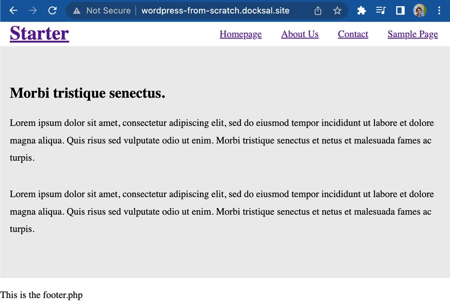
For the Starter Beginner theme body we will just do two sections. An about and recent posts section. Because we have a file named front-page.php WordPress will use it as the homepage that we created in the part 1 tutorial.
About section - front-page.php
<section class="section--bg home--about">
<div class="container">
<h2>Morbi tristique senectus.</h2>
<p>Lorem ipsum dolor sit amet, consectetur adipiscing elit, sed do eiusmod tempor incididunt ut labore et dolore magna aliqua. Quis risus sed vulputate odio ut enim. Morbi tristique senectus et netus et malesuada fames ac turpis.</p>
<p class="no-bottom">Lorem ipsum dolor sit amet, consectetur adipiscing elit, sed do eiusmod tempor incididunt ut labore et dolore magna aliqua. Quis risus sed vulputate odio ut enim. Morbi tristique senectus et netus et malesuada fames ac turpis.</p>
</div>
</section>
I wrapped the container with a section to add background color and top and bottom padding. There is also a utility class on the bottom p tag to balance out the margin from the section.
Now anytime we want the global padding for the theme we use a section element.
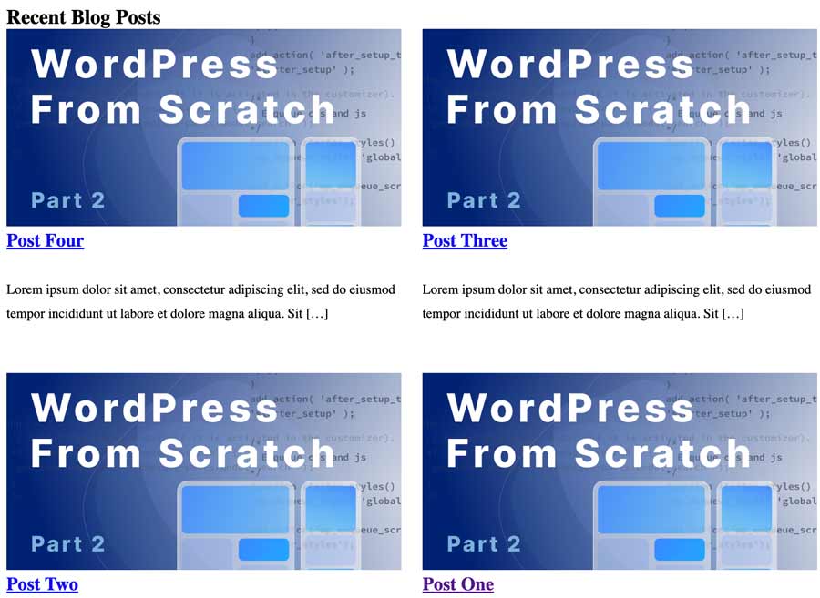
Latest Blog Posts Section
We are going to show the latest four blog posts on a two column grid. First we need to add featured image theme support to functions.php.
function.php
/*
* Featured Image
*/
add_theme_support( 'post-thumbnails',array('post'));
We also need to add the custom excerpt length to functions.php for the summary.
/**
 * Filter the except length to 20 words.
 */
function excerpt_length( $length ) {
    return 20;
}
add_filter( 'excerpt_length', 'excerpt_length', 999 );
font-page.php
Now we can use the get_posts function in a foreach loop to get the latest posts. Then we check if the post has a thumbnail/featured images. Then get the title and link using the get_permalink function. Finally we get the excerpt.
<section>
<div class="container">
<h2 class="section-title">Recent Blog Posts</h2>
<div role="list" class="col-two">
<?php
// Start the loop
$lastposts = get_posts( array(
'posts_per_page' => 4
) );
// foreach loop
if ( $lastposts ) {
foreach ( $lastposts as $post ) :
setup_postdata( $post ); ?>
<article role="listitem" class="grid">
<?php if (has_post_thumbnail( $post->ID ) ): ?>
<?php
$image = wp_get_attachment_url( get_post_thumbnail_id($post->ID), 'thumbnail' );
$image_id = get_post_thumbnail_id();
$image_alt = get_post_meta($image_id, '_wp_attachment_image_alt', true);
 ?>
<img src="<?php echo $image ?>" alt="<?php echo $image_alt ?>"/>
<?php endif; ?>
<h3 class="summary--title"><a href="<?php echo get_permalink( $id ); ?>"><h3 class="summary--title"><?php the_title(); ?></h3></a></h3>
<p><?php the_excerpt(); ?></p>
</article>
<?php
endforeach;
wp_reset_postdata();
} ?>
</div>
</section>
Here again we are use using a mobile first media query that will remove the grid style for screen sizes below 45em.
As we build out the page I am checking Google Lighthouse to make sure we are getting top scores.
Footer
For the footer layout I used a three column, starting with the copyright, site map navigation and then the Socials. Using grid CSS we will stack them in opposite order for mobile.
functions.php
'footer' => __( 'Footer Menu', 'starter' ),The footer will be full width to match the header. Fist we need to register a footer menu in functions.php that will go right below the Main Menu we have registered.
Admin - menus
Then we can create a new menu in the admin, add some pages and check the Footer Menu box in Menu Settings and Save Menu.
footer.php
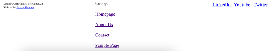
<footer class="site-footer">
<section class="container col-three">
<div class="footer--social">
<a class="socials" href="#" target="_blank" aria-label="LinkedIn" rel="noopener"><span class="icon-social">LinkedIn</span></a>
<a class="socials" href="#" target="_blank" aria-label="LinkedIn" rel="noopener"><span class="icon-social">Youtube</span></a>
<a class="socials" href="#" target="_blank" aria-label="LinkedIn" rel="noopener"><span class="icon-social">Twitter</span></a>
</div>
<div class="footer--menu">
<div class="sitemap">Sitemap:</div>
<?php wp_nav_menu(array(
'theme_location' => 'main',
'container' => false,
'menu_class' => 'menu-items',
));
?>
</div>
<div class="copyright"><p class="no-top">Starter © All Rights Reserved 2022<br>Website by <a href="#">Jeremy Faucher</a></p></div>
</section>
</footer>
<?php wp_footer(); ?>
</body>
</html>
The grid is using grid-template-areas where we define the three sections of the footer and give each section a grid-area name. Then I made the col-three grid class auto-fill with a width to fit the three columns and added to the mobile first media query.
Using the grid-template-area allows you to stack the sections for mobile in the order you want. So you will see it moves the socials on the right to the top in mobile.
Final CSS
We have a fully responsive homepage and some base styles with about 150 lines of CSS. The containers, sections and grids are also ready for the interior pages. The :root global styles are started and I also started a little page styling with the p tag class as well.
:root {
    --clr-section-bg: #e9e9e9;
}
/**
* General Styling
*/
* {
    box-sizing: border-box;
    margin: 0;
}
p {
    line-height: 1.8;
    margin-top: 21px;
    margin-bottom: 31px;
}
img {
    max-width: 100%;
    height: auto;
}
/**
* Utilities
*/
.no-bottom {
    margin-bottom: 0;
}
/**
* Sections & Containers
*/
body section {
    padding: min(10vh,10em) 0;
}
section.section--bg {
    background: var(--clr-section-bg);
}
.container--full, .container {
    margin-right: auto;
    margin-left: auto;
    padding: 0 21px 0px 21px;
}
.container {
    max-width: 992px;
}
/**
* Grids
*/
@media (min-width: 45em) {
    .col-two {
        display: grid;
        grid-template-columns: 1fr 1fr;
        grid-gap: 25px;
    }
    .col-three {
        display: grid;
        grid-template-columns: repeat(auto-fill,minmax(262px,1fr));
        grid-gap: 22px;
    }
}
/**
* Header
*/
header.container--full {
    padding-top: 4px;
}
@media (min-width: 45em) {
    .header--content {
        display: flex;
        justify-content: space-between;
        align-items: end;
    }
}
.header--content > * {
    display: flex;
    justify-content: center;
    padding-bottom: 10px;
}
/* Nav */
header ul.menu-items {
    margin: 0;
    padding: 0;
}
.nav-list a {
    font-size: 18px;
}
.primary-nav ul.menu-items li {
    margin: 0 18px;
}
.primary-nav ul {
    display: flex;
    list-style: none;
}
header ul.menu-items li:last-child {
    margin-right: 0;
}
/**
* Footer
*/
footer .col-three {
    grid-template-areas: "copyright footer-menu footer-social";
}
.site-footer {
    padding: 2em 0;
    color: var(--clr-neutral-100);
    background-color: var(--clr-white);
}
/* Copyright */
.copyright p {
    display: inline-block;
    font-size: 9px;
    line-height: 12px;
    color: var(--clr-dark-gray);
    margin-top: 0;
}
div.copyright {
    grid-area: copyright;
}
/* Menu */
footer .sitemap {
    font-size: 12px;
    font-weight: 700;
    margin-bottom: 9px;
    color: var(--clr-dark-gray);
}
footer ul.menu-items {
    list-style: none;
    font-size: 15px;
    padding-left: 2px;
    margin-top: 0;
}
footer ul.menu-items a {
    display: grid;
    padding: 8px 8px 8px 0;
}
.footer--menu {
    grid-area: footer-menu;
}
/* Socials */
span.icon-social svg {
    width: 25px;
}
a.socials {
    fill: var(--clr-dark-gray);
    padding-right: 7px;
}
a.socials:hover {
    fill: var(--clr-black);
}
div.footer--social {
    justify-self: end;
    grid-area: footer-social;
}
/**
* Homepage
*/
.home--about p {
    max-width: 737px;
}
Testing
We can easily start to scale the site now and maintain our clean Lighthouse scores. Be sure to log out of the admin to test your Lighthouse scores. We are getting all 100's. The only reason Best Practices is lower is because my local machine is not on HTTPS.
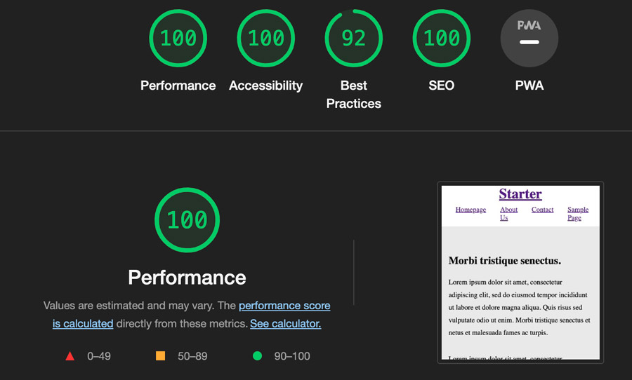
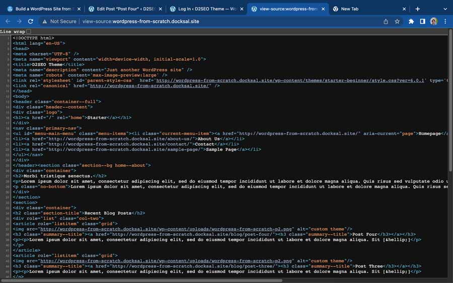
Our source code is nice and clean, no line breaks and only 80 lines of HTML code. You would hardly know it is a WordPress site!
What would be next?
Next would be creating the interior page categories and posts. I am going to conclude this series for now. I think this is a really good base starter setup for building custom WordPess sites.