Components are perceived by many to be the holy grail of web technologies. They definitely have there place and give us a way to create reusable features without having to duplicate code or even content. They are good for elements on your site that get reused across multiple pages like pre-footer sections, tabs and sliders or the many other ways there are to present content.
On the topic of components
This can be a bit of a nebulous topic and depending on who you talk too, you can get a myriad of perspectives. Going down the path of components takes serious planning and like any programmatic way of building there is all ways the risks of technical debt.
The DRY method
Components follow a D.R.Y (don't repeat yourself) model. The idea is if you have to write code more than once in multiple places, then it should be put into a function. Which in general is a good idea, although just like the risk of going all in on a programmatic setup, using D.R.Y has its draw backs to consider.
The WET method
There is also the W.E.T (write everything twice) model. The idea here is that you don't rush into a D.R.Y model or at least wait until you have written the same code three, four plus times. This gives you a chance to see what is working before committing to a more central based architecture.
Things to consider
Consider what if you have built this component that is being used across your site and you need to tweak the functions key name. The output settings are expecting a specific key name from the component function that you updated. Now you would need to update each place where the component is outputting. For static built sites this is not that big of a deal, but for CMS's like WordPress you would have to deal with dynamic content on a live site.
As you can see there are some things to consider when using components. I recommend keeping a progressive enhancement approach in mind and take advantage of them when needed. Also have a balanced approach for managing code and content that utilizes your situations options for what they do best.
Nunjucks to the rescue
Nunjucks has a great feature called macro that you can use to create simple components. The Nunjucks macro creates reusable chunks of content. This is also a great way to get started with web components.
We'll build a start to finish component using 11ty as the builder, and Nunjucks for the templating language. Nunjucks is a robust light weight template engine that is easy to work with and has good documentation. It also goes very nicely with 11ty to help programmatically build out features.
Build the easiest full fledge component ever with 11ty and Nunjucks
First we'll create a project folder and initialize node.
npm init -y
With a new node project created we can add 11ty.
npm install @11ty/eleventy
Once 11ty is installed we'll add a start command to the package.json file.
"scripts": {
"start": "eleventy --serve",
"build": "eleventy"
},
Start Eleventy with the npm start command. Now that we have Eleventy running we're ready to go.
Simple display card component
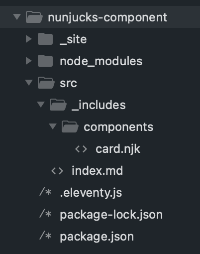
This will be a more minimal setup just using a src folder with a _includes folder and a components folder. We'll build a basic card component that gets added to a .html or .md file. Here's what it will look like when we're finished.
Example

About the content of the card to help promote your website.
link
I will be setting up the .eleventy.js file first by adding the standard module.exports. Set the directory to the default output by using the _site folder. For the entry point set the input to the src folder we created.
Then let 11ty know the templateFormats and set the markdownTemplateEngine: "njk" to parse the files before markdown renders the rest of the file. Also add passThroughFileCopy to let 11ty know were going to be using additional files that are not Eleventy templates.
module.exports = function(eleventyConfig) {
   return {
    dir: {
      input: 'src',
      output: '_site'
    },
    templateFormats: [
      'html',
      'md',
      'njk'
    ],
    passthroughFileCopy: true,
    markdownTemplateEngine: "njk"
  }
};
In the components folder create a file called card.njk then add the macro and expressions to that.
This is a typical 11ty folder structure where the index.md file is the homepage and everything in our _includes folder is like our theme files. Here we can create a head.njk, footer.njk and so on.
Then we would build out the site pages inside the src folder.
The macro uses params to pass in our parameters. It works like a function that takes in variables we can use to return our values.
{%- macro component(name, params) -%}
<style type="text/css">
div.card {
  box-shadow: 0 1px 6px 0 rgb(32 33 36 / 28%);
  background: white;
  border-radius: 8px;
  padding: 21px;
  display: flex;
  gap: 2rem;
}
.card .one-third {
  width: 40%;
}
.card .two-thirds {
  width: 70%;
}
</style>
  <div class="card">
	<img src="{{ params.imageUrl }}" class="one-third">
	<p class="two-thirds">{{ params.text }}<br> <a href="{{ params.link }}">Link</a></p>
</div>
{%- endmacro -%}
This will add the styles inline with the component. You can also add the styles dynamically by chaining the CSS to the front matter as shown below.
Now we can create our 11ty index.md file in the src folder. Before we can add the component we have to import the macro.
<!DOCTYPE html>
<html>
<head>
  <title>Document</title>
</head>
<body>
{%- from "components/card.njk" import component -%}
{{ component('card', {
imageUrl: 'https://design2seo.com/assets/blog/11ty/nunjucks-if/nunjucks-if.jpg',
text: 'About the content of the card to help promote your website.',
link: '#'
}) }}
</body>
</html>
And that's it, we have a full fledged component that can be manage from one place and has dynamic content.
To continue building a site from here we would pass through the .css in the .eleventy.js file, then link it to a base.njk file and chain it to the post front matter.
I have a Build a blog with 11ty series that covers this process.
Chaining CSS to front matter
A more efficient way to include the CSS for the component is to make a component-card.css file in the _includes folder. Then in a base.njk file create an if statement to check if the page front matter exists.
{% if (componentCard) %}{% include "component-card.css" %}{% endif %}In the .html or .md file front matter add the variable componentCard. I like to add the on tag just as a helpful indicator, but it is not needed.
---
componentCard: on
---
I also use this method for setting up different page layout options kind of like templates.
Conclusion
At the moment, I am not seeing an option to add specific CSS or JS to the component but will be keeping an eye out for this. That's ok, I prefer to manage my CSS and JS through the _includes folder and front matter anyway.
For me this is a great-simple way to build components in Eleventy. These reusable nuggets are awesome!